Art theory has always been my favourite topic to teach. Not least because I believe that understanding art in a structured way enables the discipline to be more comprehensible and relatable. As an art teacher, I have met one too many who resign themselves to fate and shun art, declaring that they are simply not talented because they find art a great mystery that they believe only a chosen few would be able to grasp.
Among such uncertainty, creating pictorial compositions is what I see to be the greatest hurdle for an amateur. I would therefore like to take this opportunity to discuss the Principles of Design in enabling one to create solid artistic compositions. Hopefully, as one begins to understand these guidelines, art would appear to be less cryptic and enigmatic and intimidating.
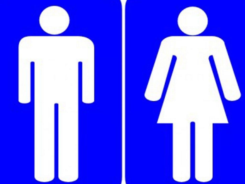
I would like to use English compositions as a point of reference due to its similarity to its artistic counterpart. A composition written in an English lesson typically tells a story using words, and artists similarly employ the elements of art to the same effect. As the saying goes, a picture paints a thousand words. That picture might be even more effective in expressing messages thanks to universal nature of visual literacy. For instance, one might not understand the words that spell out ‘male’ or ‘female’ in a foreign language when visiting the lavatory in a faraway land, but one would never fail to comprehend the male or female symbol on the door of one (even the colour the door is painted in.) As Edward Hooper once so rightly mused, ‘If you could say it in words, there would be no reason to paint.’
It is vital then, that we learn how to effectively create an effective and affective piece of composition utilising the artistic version of written words such as lines, shapes, texture, colour and value or what we call the ‘elements of art’. Of course a story will never be easily understood if they are not governed by grammar in a piece of writing. Principles of design then act in that same fashion as the governing authority in which we work to create legibility within the pictorial space where we are free to express a thought, an opinion, a story or a feeling. Let us then just jump right in to the details, beginning from what I feel are the key principles of design.
Emphasis
Emphasis is what I call the staple principle. It is the bedrock of all good layouts. It is essential because among all the elements present, it draws attention to the most important one that the eyes should see first. Imagine going to a concert to see your favourite pop idol, and not being able to make her out on stage from among her backup dancers. Something about her should enable her to visually stand out and be recognizable. This can be done in many ways, such as making her outfit stand out, or by placing her in centralized position. In art, emphasis is equally importable because there is a similar situation as to what to goes on stage at a concert where many elements gather but only one should steal the show.
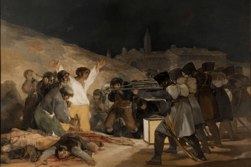
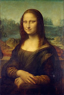
As mentioned, emphasis is achieved simply by centralising an element, enlarging the subject matter or creating a visual differentiation from the rest. It is easy to emphasize an object if there is only one main one to begin with, as in the Mona Lisa, while it becomes increasingly more difficult to do so with other elements thrown into the mix. For instance, in Francisco Goya’s The Third of May , emphasis is directed immediately to the Spanish man clad in white shirt and light beige pants ,who stretches his arms out in submission because he is surrounded by the French troop. All focus is on him despite the presence of other figures because his white shirt differs from the rest who are clad in dark tones.
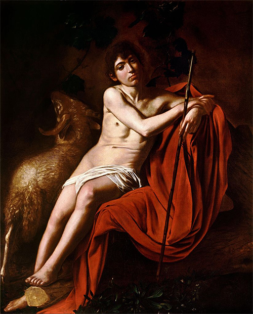
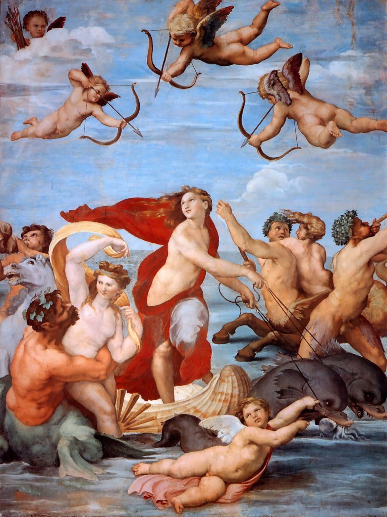
Another method employed can be seen in the work of the Renaissance master, Raphael’s Galatea, who used leading lines disguised in his bevy of cupids in an arch-like line-up. The winged infants guide in leading the eyes to look at the central character. The Baroque artists instead create emphasis through their mastery at tenebrism, employing theatrical lighting to strategically to highlight their object of focus. When the strong beam of light is cast on the subject of interest, the eyes automatically move towards it as seen in Caravaggio’s St John the Baptist. One sees St John clearly under a strong ray of light in a faux metaphorical stage.
Contrast
Contrast sees the placement of elements characteristically different from each other together so that emphasis can be achieved (as seen in the above examples), or to enable certain parts of the work to stand apart from each other visually. Sans contrast, one would not be able to tell the sense of depth in the work nor differentiate between the foreground and background. What makes contrast different from emphasis, is that the latter seeks to amplify the visual presence of one element, while the former focuses not necessarily on only one element. There are a variety of ways one can create contrast pictorially. Some examples include pairing an organic shape with a geometric shape , variations in size (big vs small), shadow against light, and using colours of opposite temperature together. The key here is to be strikingly different. Indeed, contrast and emphasis can sometimes even overlap and both ways can be used to kill two birds with one stone as they share similar qualities.
Unity and Variety a.k.a Rhythm
Rhythm, pattern, movement, unity and variety are usually listed as separate principles, but I shall address them as a collective. The reason for this is because unity and variety exist together to create rhythm and movement , and pattern itself is a form of unity. Rhythm is defined as a strong, regular repeated pattern of movement or sound. One only has to think of their favourite song to understand how rhythm is created through the similarity and difference that fuses together in a great tune that one cannot get out of their head. It is key to note that without unity and variety existing in tandem together, rhythm and movement cannot be created.
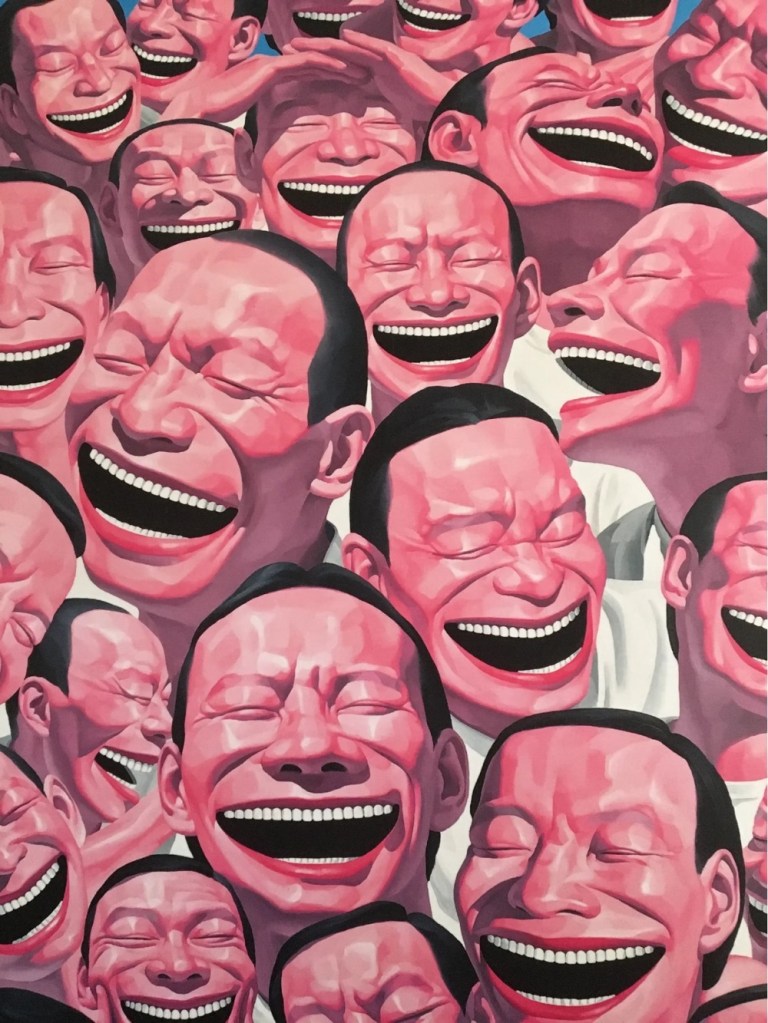
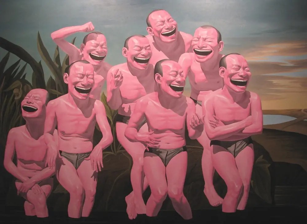
In Yue MinJun’s satirical art featuring a seemingly infinite number of laughing men , one can almost feel the rhythm pulsate among the sea of faces. Every countenance eerily possess the same features, but there is a slight variation in terms of the angle where the face is turned. One head is laughing so hard and probably for so long that he has to use his hands to shelter his laughing eyes from the invisible sunshine. In Free and Leisure, the same group of men (now thankfully only eight this time) monochromatic men are seen with their signature mocking laughter.This time their bodies are featured and the variation can be seen in their laughter with their body , torsos slightly turned in various direction. One with folded arms , another with one arm slightly raised. One can see the rhythm and movement in that echoes through the similarity (in the faces), as well as the slight distinction in certain details.
Abstract painter, Piet Mondrian also used unity and variety to depict rhythm to evoke a sense of movement and vigour in his iconic paintings. He described his paintings as a visual ‘dynamic equilibrium’, which he hoped would work on the individual spirit and have wider social implications. This dynamism is demonstrated in the mastery of his repeated bold black lines which get their variety from the unequal division and the added bursts of primary colour in between.

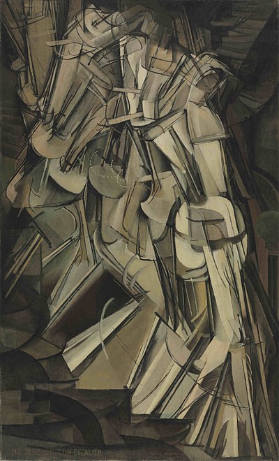
Another classic example of unity and variety is seen in Marcel Duchamp’s Nudes Descending Down the Stairs, a pseudo motion picture projected on a stationary two dimensional painting. His work depicts a body in walking down a narrow stairway where the figure appears in succession, but the angle of the joints at various parts vary slightly, as if they are caught in a the respective microsecond they belong to, resembling a vintage flip book that is seen all on the same page. The visual rhythm felt here is deafening.
Balance
Balance is key in every aspect of life. A balanced lifestyle, balanced diet, work-life balance. Hence , if we want to create an artwork that has life and can thrive, we require the same ingredient in our creative process. There are two types of balance that I would like to address here, namely symmetrical and asymmetrical balance. Symmetrical balance is easily achieved because both sides are like a mirror image. This type of balance is way easier to create because one does not have to ponder too much on how to balance both sides out since they are basically mirrored on both sides. Asymmetrical balance however, is more complicated to achieve because despite the absence of symmetry, both sides are still balanced out by visual weight. If I had to put it in visual terms, imagine a seesaw with two equally placed people of the same weight. That is the equivalent of symmetrical balance. On the other hand, for, asymmetrical balance, one side is heavier than the other, one then has to find ways to balance it out by asking most people to join the lighter side, or to shift the weight to comply to the science of physics. Although the latter is more complicated to achieve, they are more widely used in compositional concoctions because of their tendency to be more interesting.
Special mentions: Gravity and Visual Weight
Just today, I conducted a lesson on drafting pictorial layouts. I found many students have created compositions that saw their elements semi-floating in the air, unrooted to the bottom of the work. The laws of gravity in life dictates that what is heavier would sink to the ground. This applies to art as well. Works that have their visual weight planted at the top half of the pictorial space can look awkward, but its a common mistake many make when planning a composition.
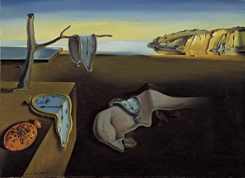
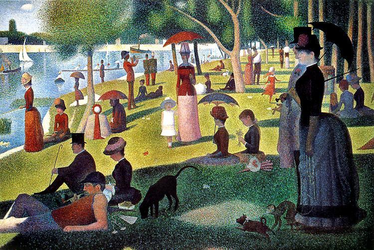
Notice the right foreground of Salvador Dali’s Persistence of Memory. The foreground is in a darker tone to root the visual weight to the bottom even though the left hand side of the work is more crowded. The same device is employed in Seurat’s painting where the bottom part of the work is darker, shaded from the sunlight that stretches across the island. The weight is reinforced further at the bottom by the figures that gradually grow in size due to the rules of perspective. Note that visually, elements can possess different weightage. As a general rule of thumb, what is darker in value, more intense in hue, more in numbers or bigger in scale weigh more in comparison to what is lighter in value, less intense in hue, less in numbers or smaller in scale.
A summary
Obviously, it would be impossible to fit all principles together in a picture and that would be a recipe for disaster for many cooks can spoil the broth. Using these principles proficiently so that they would serve you in succinctly communicating your message to create an aesthetically pleasing visual outcome can be difficult, but it becomes easier one takes a step-by-step approach. My general advice to is to begin by focusing on creating emphasis with a single subject matter and to subsequently build on that. It is really necessary to have something to work with before you start to decide if you need to shift things around. It is also at the later stage where you can start to discern the other principles you have to add on top of what is already on paper.
To conclude, yes we are discussing general guidelines, but we must never forget to leave some room for exceptions, creativity and flexibility. I wish you good luck in creating your first masterpiece, and to remember that rules are learnt so that some of them can be broken. Never conform to the rigidity of guidelines and get lost in the world of monotony. In the words of the wise Pablo Picasso, one must ‘learn the rules like a pro so that you can break them like an artist.’

Leave a comment