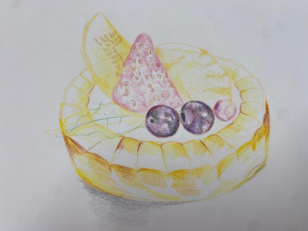
The very moment people hear that I am an art teacher, their first question would usually be to ask what type of medium I am best at. Most of my colleagues have a direct answer to that question , but not me. I love writing about Art and I truly consider writing about art to be my forte. However, if I had to pick a medium I greatly enjoy working with, my pick would be the good old trusty colour pencils. One of the perks of my job includes having access to top range sets, but I always enjoyed the good old classic brand, Stabilo Luna. This was the very set that I have been using since my secondary school days. I find them powdery and blendable. A set of 48 colours is more than sufficient in most situations. Since they are watercolour pencils, you can even use some water and a brush to create a light wash when strapped for time. Indeed, the only difference (for me) between the student range colour pencils in contrast to the expensive ones are the range of colours that are offered. At the end of the day , it is the skill of the artist that matters much more. I told the same to my colleague (who teaches another subject at school), who was recently incensed that her now daughter’s art teacher recommended the kids to get a set of colour pencils that was priced at 150 dollars. Let’s get down to the basics and have fun in creating a still-life colour pencil rendering of a fruit tart!
Tip One
Sketch lightly with a light colour pencil or a pencil. Do not press hard with the pencil. We do not want any harsh outlines.

Tip Two
Identify the areas of highlight. Do not colour over these areas as we want to leave the highlights as the white of the paper.
Tip Three
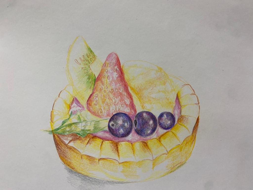
Use the lightest version of the over colour of various areas of the subject matter. If unsure choose colours from of same temperature. For instance, when colouring a red apple, choose yellow as the lightest ‘wash’. they are both warm colours.
Tip Four
Never apply with pressure when rendering. Our aim is to layer different hues on top of each other, and pressing the pencils too hard will create a waxy finish, where the new layer is not able to penetrate above.
Tip Five
In most circumstances, avoid black when rendering shadows. Use a variety of dark colours to create the dark tones such as dark blue, dark purple, grey, umber. Layering these colours can give the same effect that black does, without creating a tone that is too harsh.
Tip Six
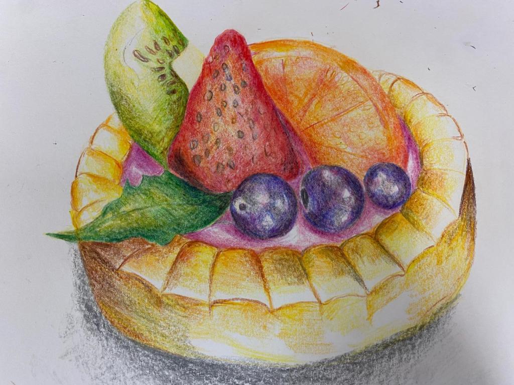
Always keep your pencils sharp. Sharp pencils enable the pigments to come off more efficiently and creates a tidier aesthetic.
Tip Seven (Applicable to art creation in general)
Always take a break when you feel that you need one. Not taking a break when you need to is a surefire way to destroy your artwork through overworking it.

Leave a comment